Tips for Creating High Converting Landing Pages

by Rick Austin
1) ALWAYS INCLUDE these Critical Elements of an Effective Landing Page
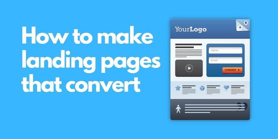
Landing pages, sometimes also called “lead-capture pages,” are fantastic for converting visitors into leads by interacting with the page in some way (ie. Filling out a contact information form or clicking on a purchase button). In order to make these transactions happen, it’s critically important that your landing pages consist of the following elements
- A headline and an (optional) sub-headline
- A brief but clear description of your offer and it value
- At least one image relating to your offer
- Third party influences such as testimonials or security badges
- And most importantly, a contact form to capture visitors’ information. This is the main lead generator of the landing page
2) Make Sure Your Landing Page Headline matches its Corresponding CTA
It is imperative that you maintain a consistent message in both your call-to-action (CTA) and the headline of the landing page. If your visitors click on one of your CTA’s for a free offer only to find out there’s some kind of catch on your landing page, you’ll instantly lose their trust and increase your bounce rate.
Similarly, if the headline reads differently than the CTA, it might lead to confusion, and the visitor might wonder if the CTA is linked to the wrong page.
The safest bet is to simply eliminate any and all confusion by making sure that your landing page consistently reflects what you promised in your call-to-action — and vice versa.
3) Remove the Main Navigation
Once you get someone to visit your landing page, your first objective is to keep them there! So, if there are links on the page that enable visitors to navigate your website, you run the risk of distracting them, which creates Barriers to Conversion (I’ll discuss this in more depth in a future post) and increases the chance they’ll Abandon the page (We’ll discuss more about Landing Page Abandonment later too) before they have a chance to convert.
This is one of the biggest mistakes on many landing pages and it’s very easy to solve! One of the best ways to reduce this Barrier to Conversion and increase your overall landing page conversion rates is to simply remove the main navigation from the page. Easy peasy….
4) Minimalist is Best
Those of you that come from the sales or marketing field are most likely familiar with the phrase “Keep it simple, stupid.” Well, we need to remember to maintain that “simple” philosophy to landing page design A cluttered or messy landing page will almost certainly result in a distracted, confused and overwhelmed visitor. Instead, use as much White Space as possible and keep the text and images on the page simple and to-the-point. (I will discuss the Science of Eye Tracking in a later post)
5) Only Ask for Information You Really Need
I’m often asked about how much or how little information we should request on contact forms. Well, unfortunately, there’s no perfect one-size-fits-all answer to this. However, the best answer I can give is to use the least amount of fields necessary to get qualified leads and reduce the number of “tire kickers”. The less a visitor needs to fill out, the higher your conversions will be. A long form will seem s like more work and will often be ignored by the visitor.
6) Be Social
Social media links to your business will help to improve LIKE and TRUST, the two pillars of any sale! To avoid cluttering your page, sure that you only include buttons for the social platforms your audience uses.
Also, please don’t forget to include an option to email you because visitors have many contact preferences
I hope some of you find this useful. If so, let me know. You may also feel free to message me with any questions.
Recent Posts

How KFC Played the Media Like a Violin
August 23, 2016


